CSS media breakpoints cheatsheet
I get asked quite frequently for CSS media breakpoints, and although this list is probably far more than you would ever use in a production environment, it’s useful to have as a reference for those special times when you want something pixel-perfect.
Personally, I’m of the opinion that it’s pointless to develop a website that’s not responsive – ie a website that uses media queries to rearrange layouts when the viewport changes.
Not only will multiple users with various-sized devices be able to read the content more clearly, but search engines are more savvy these days with presenting mobile-friendly content as search results to devices.
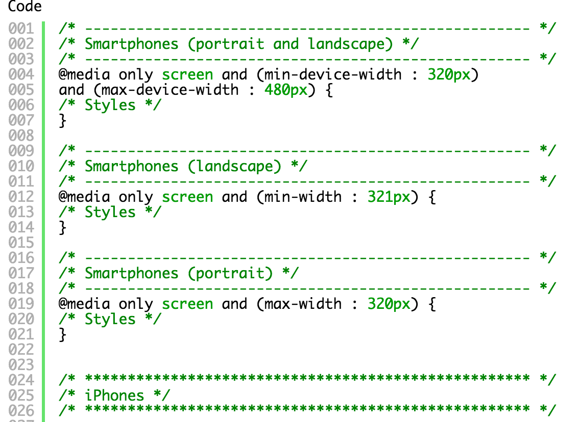
So without further ado – here are the CSS media breakpoints. Just copy and paste the code to your CSS files.
/* ---------------------------------------------------- */
/* Smartphones (portrait and landscape) */
/* ---------------------------------------------------- */
@media only screen and (min-device-width : 320px)
and (max-device-width : 480px) {
/* Styles */
}

/* ---------------------------------------------------- */
/* Smartphones (landscape) */
/* ---------------------------------------------------- */
@media only screen and (min-width : 321px) {
/* Styles */
}

/* ---------------------------------------------------- */
/* Smartphones (portrait) */
/* ---------------------------------------------------- */
@media only screen and (max-width : 320px) {
/* Styles */
}


/* **************************************************** */
/* iPhones */
/* **************************************************** */

/* ---------------------------------------------------- */
/* iPhone 4  */
/* ---------------------------------------------------- */
@media only screen and (min-device-width : 320px)
and (max-device-width : 480px)
and (orientation : landscape)
and (-webkit-min-device-pixel-ratio : 2) {
/* Styles */
}

@media only screen and (min-device-width : 320px)
and (max-device-width : 480px)
and (orientation : portrait)
and (-webkit-min-device-pixel-ratio : 2) {
/* Styles */
}

/* ---------------------------------------------------- */
/* iPhone 5  */
/* ---------------------------------------------------- */
@media only screen and (min-device-width: 320px)
and (max-device-height: 568px)
and (orientation : landscape)
and (-webkit-device-pixel-ratio: 2){
/* Styles */
}

@media only screen and (min-device-width: 320px)
and (max-device-height: 568px)
and (orientation : portrait)
and (-webkit-device-pixel-ratio: 2){
/* Styles */
}

/* ---------------------------------------------------- */
/* iPhone 6 */
/* ---------------------------------------------------- */
@media only screen and (min-device-width: 375px)
and (max-device-height: 667px)
and (orientation : landscape)
and (-webkit-device-pixel-ratio: 2){
/* Styles */
}

@media only screen and (min-device-width: 375px)
and (max-device-height: 667px)
and (orientation : portrait)
and (-webkit-device-pixel-ratio: 2){
/* Styles */
}

/* ---------------------------------------------------- */
/* iPhone 6+  */
/* ---------------------------------------------------- */
@media only screen and (min-device-width: 414px)
and (max-device-height: 736px)
and (orientation : landscape)
and (-webkit-device-pixel-ratio: 2){
/* Styles */
}

@media only screen and (min-device-width: 414px)
and (max-device-height: 736px)
and (orientation : portrait)
and (-webkit-device-pixel-ratio: 2){
/* Styles */
}


/* **************************************************** */
/* iPads */
/* **************************************************** */

/* ---------------------------------------------------- */
/* iPads (portrait and landscape)  */
/* ---------------------------------------------------- */
@media only screen and (min-device-width : 768px)
and (max-device-width : 1024px) {
/* Styles */
}

/* ---------------------------------------------------- */
/* iPads (landscape)  */
/* ---------------------------------------------------- */
@media only screen and (min-device-width : 768px)
and (max-device-width : 1024px)
and (orientation : landscape) {
/* Styles */
}

/* ---------------------------------------------------- */
/* iPads (portrait) */
/* ---------------------------------------------------- */
@media only screen and (min-device-width : 768px)
and (max-device-width : 1024px)
and (orientation : portrait) {
/* Styles */
}

/* ---------------------------------------------------- */
/* iPad 3 */
/* ---------------------------------------------------- */
@media only screen and (min-device-width : 768px)
and (max-device-width : 1024px)
and (orientation : landscape)
and (-webkit-min-device-pixel-ratio : 2) {
/* Styles */
}

@media only screen and (min-device-width : 768px)
and (max-device-width : 1024px)
and (orientation : portrait)
and (-webkit-min-device-pixel-ratio : 2) {
/* Styles */
}

/* **************************************************** */
/* Samsung */
/* **************************************************** */

/* ---------------------------------------------------- */
/* Samsung Galaxy S3  */
/* ---------------------------------------------------- */
@media only screen and (min-device-width: 320px)
and (max-device-height: 640px)
and (orientation : landscape)
and (-webkit-device-pixel-ratio: 2){
/* Styles */
}

@media only screen and (min-device-width: 320px)
and (max-device-height: 640px)
and (orientation : portrait)
and (-webkit-device-pixel-ratio: 2){
/* Styles */
}

/* ---------------------------------------------------- */
/* Samsung Galaxy S4  */
/* ---------------------------------------------------- */
@media only screen and (min-device-width: 320px)
and (max-device-height: 640px)
and (orientation : landscape)
and (-webkit-device-pixel-ratio: 3){
/* Styles */
}

@media only screen and (min-device-width: 320px)
and (max-device-height: 640px)
and (orientation : portrait)
and (-webkit-device-pixel-ratio: 3){
/* Styles */
}

/* ---------------------------------------------------- */
/* Samsung Galaxy S5  */
/* ---------------------------------------------------- */
@media only screen and (min-device-width: 360px)
and (max-device-height: 640px)
and (orientation : landscape)
and (-webkit-device-pixel-ratio: 3){
/* Styles */
}

@media only screen and (min-device-width: 360px)
and (max-device-height: 640px)
and (orientation : portrait)
and (-webkit-device-pixel-ratio: 3){
/* Styles */
}

/* **************************************************** */
/* Desktops and laptops  */
/* **************************************************** */

@media only screen  and (min-width : 1224px) {
/* Styles */
}

/* ---------------------------------------------------- */
/* Large screens  */
/* ---------------------------------------------------- */
@media only screen  and (min-width : 1824px) {
/* Styles */
}
 | © 2014 John Ryan Design | All Rights Reserved | 100 percent Australian |