Captivate 2019 Branching Navigation
Since Adobe Captivate 2019 was launched, there have been a few really interesting improvements that have totally changed the way I build interactive branching navigation.
Previously, if I wanted users to choose a module to complete from a menu and then be returned to the menu to pick up the next module when they had finished (with a visual indicator that certain modules had been completed ), I would have had to either make a bunch of Advanced Actions, or write some custom Javascript.
It was just painfully laborious, but now (with a couple of caveats), I’m happy to say that Adobe is heading in the right direction with Captivate 2019.
The process locks in with a concept I’m always hammering my students about :- naming conventions. I’ve always been a bit OCD about naming conventions (I guess from all the years that I have spent working with coding languages that are brutal with typos), so this improvement works right in with my own development process.
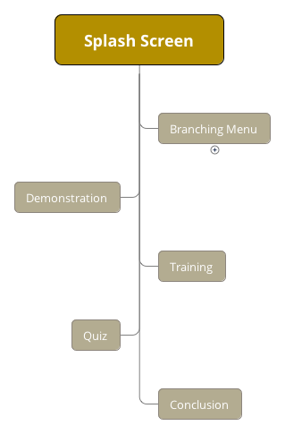
So let’s set the scenario – we have a simple e-learning application that has an introduction, a demonstration module, a training section, and a quiz.
The brief is that learners must complete all sections before attempting the quiz, and the only navigation that is possible should be from a main menu. This forces learners to complete absolutely all the content.
Check the storyboard for a more visual representation. (I use XMind to create all my storyboards).
Now before Captivate 2019, I’d just create links on the buttons on the menu page that pointed to the first slide of each section.
At the end of each section, I’d either create a button that pointed back to the main menu, or use Advanced Actions / Javascript to do the job automatically.
But that means that I’d have to remember to check all buttons for custom actions, and perhaps frame scripts as well.
In addition, I’d have to keep track of whether all slides in a section had been visited (which means that I’d have to set some hardcoded values into the project variables, and remember to update those every time I added or removed a slide from the section).
I would also have to use the variables discussed above to decide whether to show a visual indicator that the section had been completed.
Sounds painful, huh? Such is the life of an e-learning developer!
Setting up Branching Navigation in Captivate 2019
Here are some steps that you’ll have to follow to make it all work (mission-critical steps marked with an asterisk *):
Create a Splash slide. Why? Because it was on the plan, duh!!
Create a Menu Slide
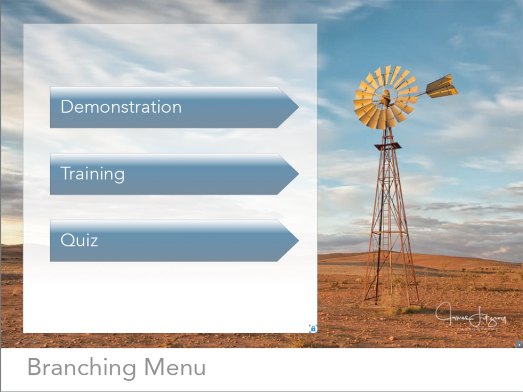
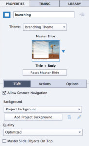
Create a menu slide and label it ‘branching’. Lower case, no space.
Without the quote marks. Exactly like that. *
The whole idea behind this branching process is that the user gets to see all available sections (apart from the quiz, if you’ve set it up that way – more about that later).
Users would click a menu button, navigate to the content, view the content, and be automatically returned to this menu once the section was completed.
The menu button would show a symbol that indicated the completed status (‘visited’ button state, covered later on in this post).
Once all previous sections were completed, the Quiz button would show.

Create content slides
Create a number of slides for each of your sections. Label them whatever way you wish. Add whatever content you like.
Create some quiz slides. Any question type you like, as many as you like.
Group Slides
This is the process that hooks up the automatic branching, so be careful and consistent!
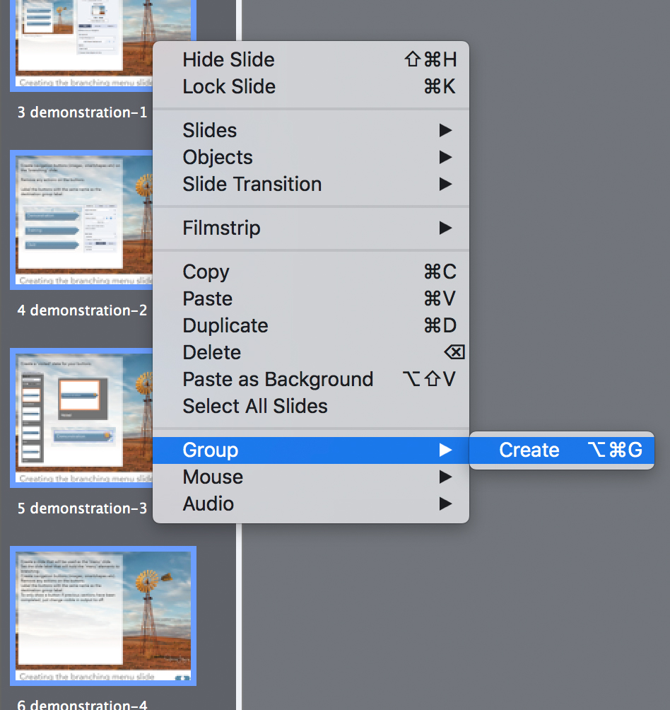
Select all slides from each single section and create a slide group from them.
Ie select all the ‘demonstration’ slides and ‘Create Group’.
Label Slide groups
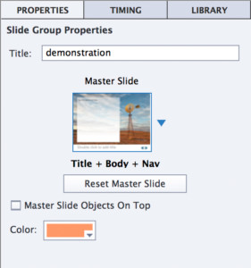
Label the group ‘demonstration’. The actual name is whatever you want to call it, as is the case.
But whatever you label the group will be used in a little while, so it pays to be consistent.
Repeat the process for the other groups of slides.
Again, be consistent in your naming conventions.

Filmstrip review
Now you should have your splash slide (if you made one), a branching slide, and however many slide groups as you have menu buttons.
It doesn’t matter how many slides are within each group, what their slide labels are, what content they contain, or how they navigate between each other (apart from the last slide in the group, which I’ll discuss later).
Create Navigation Buttons
Now that you have all the slides ready, with particular emphasis on the names you gave to your slide groups, you’re ready to create navigation buttons that will point to the first slide within each group.
So, create three buttons on your ‘branching’ – main menu slide.
You can use buttons, smart shapes, image buttons, whatever.
Menu Buttons should all have Actions set to ‘No Action’.
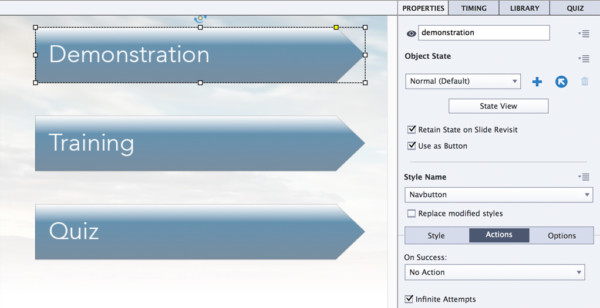
Label each button exactly the same as your slide group names.
Ie the button that would navigate to the first slide of the slide group ‘demonstration’ should be labelled ‘demonstration’.
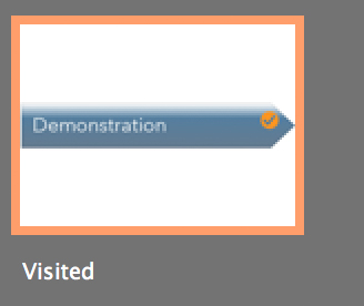
If you want to make use of the automatic ‘visited’ state of each button, select the button, click ‘state view’ in the properties panel, and add a ‘visited’ state with an indicator of completion. (I used a check mark).
Remember to check the ‘Retain State on Slide Revisit’ checkbox to make sure the check mark persists once you’ve used the button.
Rinse and repeat.
Important stuff
On the last slide in each group, if you have any slide navigation buttons, they should not have ‘go to next slide’ actions, but ‘continue’ instead.
If not, you won’t return to the menu slide after completing the section.
If you want to only make available the Quiz section when users have fully completed all previous sections, set the ‘view in output’ button to false. (that’s the small ‘eye’ icon just to the left of the button label in the properties panel).
Thank you!
Thanks to James Fitzroy Photography for the loan of his image. James is an incredible photographer who manages to capture the real essence of the Australian Outback. If you like this image, you should check out his website and his facebook page.


 | © 2014 John Ryan Design | All Rights Reserved | 100 percent Australian |