Cropping and centering fixed-width elements with CSS
Cropping and centering fixed-width elements with CSS seems, at first view, a fairly simple procedure.
But in truth, it’s actually a little more complicated.
This week, one of my students asked me if I could show him how to make sure that the mid-point of an image always remained in the dead center of it’s container as the browser window was scaled.
It’s fairly simple to use responsive CSS to scale the image down as the container resizes with the browser, but this wasn’t the goal – the requirement was that the image remained the same size, and the container merely ‘cropped’ it. At the same time, the image had to automatically sit in the middle of the frame.
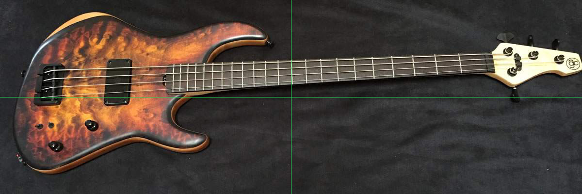
In the example below I’ve placed an image that’s 1200px x 400px into a full-width frame. The image has guides showing the centre point of the image.
Just resize the browser window and watch the image stay the same size as the container reduces in width, while the image always remains centred.
Here’s the HTML code:
Here’s the CSS code:
/*
This outermost class gives child elements
a positioning reference.
Because it's a div, it automatically displays as block;
If the element you're using doesn't display as block by default,
you'll need to add display:block to the style
this container hides content that is larger than it
*/
.relative-container {
position: relative;
overflow: hidden;
margin: 20px;
}
/*
This class uses relative positioning to move the contents
50% to the right, then translate to move it back.
This ensures that the contents are always perfectly centred
inside the container element at any browser width
*/

.content-container {
display: inline-block;
position: relative;
left: 50%;
transform: translateX(-50%);
}


 | © 2014 John Ryan Design | All Rights Reserved | 100 percent Australian |